Inquire Now


 Home
HomeThe Application of Color in Furniture Products
 May 30,2025

 Topmax Furniture
The color application of furniture products is different from that of paintings and graphic visual communication designs. The colors in paintings and graphic visual communication designs generally require high color, light and shadow effects, and pursue rich life expression and appeal. The color application of furniture is restricted by factors such as coloring process, material texture, furniture function, environment, and ergonomics, making the color characteristics of furniture simple, general, concise and bright while having good visual effects.

The color application of furniture should reflect the combination of science and aesthetics, the combination of technology and art and new aesthetic concepts, and reflect the harmonious relationship between furniture and people. It should follow and flexibly apply the aesthetic rules of modeling, which are specifically manifested as follows:
1. Selection of overall color tone
The color tone reflects the category of color, and the color tone is usually classified by hue. For example: red tones include pink, dark red, orange, etc., as well as green tones, blue tones, etc. The same furniture shape uses different tones, which will bring people different artistic visual effects and psychological feelings.
The overall color tone is the color tone with the largest area in the color of furniture products, also known as the main tone. The color design of furniture products usually expresses its design effect with the overall color tone. The main color tone of furniture is mainly selected according to the function of furniture, the use environment, the requirements of users and the functional role of color. Generally speaking, the main color tone of furniture is one or two colors, and three or more colors are rarely used. The fewer the tones, the stronger the main characteristics, the more prominent the decorative effect, and the easier it is to unify the appearance and form of furniture.
The determination of the main color tone of furniture not only takes into account the functional characteristics of the product, but also takes into account the combination of material texture and color application. The color of furniture products is composed of the texture of various material components plus the color combination. Therefore, to obtain a good color effect of furniture, it is necessary to consider the color and material texture together.
The color of furniture materials can be divided into three types: one is based on the color of pure natural materials, reflecting the natural beauty of furniture materials; the other is based on the color of pure artificial materials, reflecting the modern beauty of furniture materials; and the other is based on the color of comprehensive natural and artificial colors, combining the two beauties in one, complementing each other. When using furniture color design, most of the natural materials themselves are used to make the original and simple flavor naturally revealed. However, the colors of pure natural materials lack bright and attractive interest, while the colors of artificial materials have more freedom of choice in terms of hue, brightness, and purity than natural materials. Whether it is plain or bright, soft or strong, it can be fully utilized according to needs. However, the color effects of artificial materials are somewhat monotonous and superficial, while the colors of natural materials are thick and calm. Therefore, when designing the color of furniture, we should try to use the expression form of comprehensive utilization of natural materials and artificial materials, taking what we need and making up for our shortcomings.

2. Color configuration of Furniture Products
After the main color of the furniture is determined, in order to emphasize or embellish certain parts of the furniture as a whole, we can highlight the "key points" through color configuration. This avoids affecting the overall artistic effect of the furniture due to monotonous colors. When configuring the color of furniture, we should pay attention to the following aspects:
(1) When choosing colors that enhance changes, we should pay attention to coordination with the overall color tone, especially when using colors with strong contrast and large changes, we should pay attention to not destroy the overall sense of the furniture color.
(2) According to the visual effect and the psychological needs of the user, according to the color function and color feeling, choose the color used to highlight the key parts of the furniture. The fewer the color types, the stronger the decorativeness of the furniture and the easier it is to unify the color tone. If there are too many colors, it is easy to cause color segmentation and it is difficult to unify the color tone, which will destroy the harmony of the furniture product. At the same time, it is not conducive to the implementation of the coloring process, resulting in increased economic costs.
(3) The color selection should not be too bright or dazzling. It should reflect the functional characteristics of the furniture product and give people a pleasant, vivid, bright and soft visual effect and psychological feeling.
(4) The color area that highlights the key points of the furniture should not be too large. Usually, a large area of high brightness and low purity color is used as the base tone of the furniture, and a small area of high purity color is used to embellish the local area for contrast. In this way, the furniture product can easily achieve a harmonious, rich and eye-catching effect.
3. Color balance
The content and methods of color balance of furniture products can be found in the table below
| Content | Method |
| Proper distribution of colors | The color balance method of furniture should be clear in primary and secondary, symmetrical in layout, and harmonious in levels. In this way, the main color will not be too concentrated visually, and the auxiliary color will not be eclipsed. |
| Combine the shape, volume and quantity factors of furniture products | For furniture of different shapes, the contrast of light and dark on their surfaces will be different. For example, a cube and a sphere of the same volume are decorated with the same color. It can be seen that the contrast of light and dark on the surface of the sphere is stronger than that on the surface of the cube, and the color effects produced by the two are different. |
| When designing large-scale colors, you should choose a color scheme with high brightness and relatively small amounts of low-purity colors. | For cabinet furniture, except for a few designs that pursue far-reaching effects to attract people's sight, choosing colors with high brightness, low purity and small color contrast can make people feel bright, comfortable, harmonious and peaceful, which is conducive to maintaining a good mental state for a long time and engaging in work activities. |
| For the color design of small furniture, different color balances should be adopted according to different design objects. | For small furniture, it is advisable to use strong contrast color configuration to ensure that the furniture image is clear and powerful, and to highlight the artistic effect of the appearance of the furniture. |
| Balance colors according to color functions and color perception | If you want the furniture to fully express its sense of stability, the upper part should use light colors and the lower part should use heavy colors; if you want the furniture product to have a strong three-dimensional sense, you can make the warm and cold relationship of the left and right colors of the furniture the same as the upper part, and the colors of the rest of the parts are opposite to the upper part to form a contrast and enhance the three-dimensional sense; if you want to show that the upper part of the furniture product is scattered and the lower part is integrated, the upper part of the furniture can be transparent and the lower part can be opaque. |
4. Human-machine coordination
Different color configurations will produce different visual effects and psychological feelings. Appropriate color design and color configuration can make furniture users feel comfortable, light and uplifting at work. If the color selection and color configuration are unreasonable, it is easy to make consumers feel confused, dull and depressed. Therefore, furniture color design should fully reflect the coordinated relationship between man and machine and benefit the physical and mental health of users.
The color design of furniture must seriously consider the user's understanding and needs of color. The population analysis of color design is to make color plans and implement these plans based on the commonalities and differences of color desires of people within a certain range in nature and society. Therefore, the color design of furniture fully reflects the principle of people-centered, commonality and individuality, universality and diversity.
The design of furniture color should also meet people's physiological and psychological needs. Infect people's psychological emotions and bring people a comfortable, friendly, relaxed and novel feeling through color. In addition, color design should also meet the characteristics of the times and reflect the aesthetic and preference characteristics of color in the times. In addition, due to the differences in countries, regions, nationalities, religious beliefs, living habits, climate, and geographical location, people's preferences and taboos on colors are also different, which should be fully considered in furniture color design.
China is a vast, multi-ethnic country. There are certain differences in the preferences and taboos of colors among different nationalities and regions. In terms of regions, the north likes warmer colors, deep, strong, and bright colors; the south likes cooler colors, simple, bright, and light colors. In terms of ethnicity, due to different ethnic traditions, habits, and beliefs, the preferences and taboos of colors among different ethnic groups are also different (as shown in the following table).
| Nationality | Preferences | Taboo |
| Han | Red represents joy | Black and white are mostly used for funerals |
| Mongolian | Orange, blue, green, purple | Black and white |
| Hui | Black, white, blue, red, green | White for funerals |
| Tibetan | White is the noble color, black, red, orange, purple, dark brown | Light yellow and green |
| Miao | Cyan, dark blue, dark green, black, brown | Yellow, white and beige |
| Uyghur | Red, green, pink, rose red, purple, blue and white | Yellow |
| Yi | Red, yellow, blue, black | |
| Zhuang | Sky Blue | White |
| Manchu | Yellow, purple, red, blue | |
| Jing | White, brown and white | |
| Dai | Whit | |
| Li | Red, brown, dark blue, black |
 TOPMAX Furniture Captivates Global Audience at imm cologne 2025
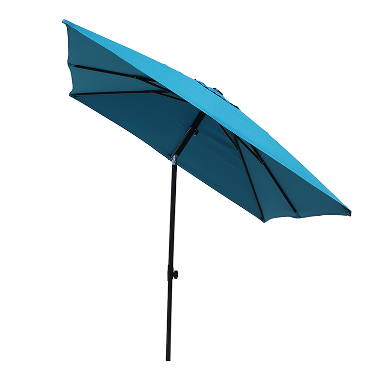
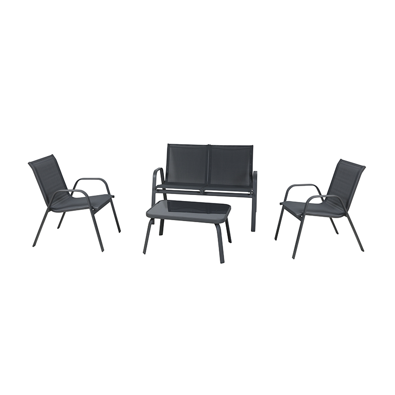
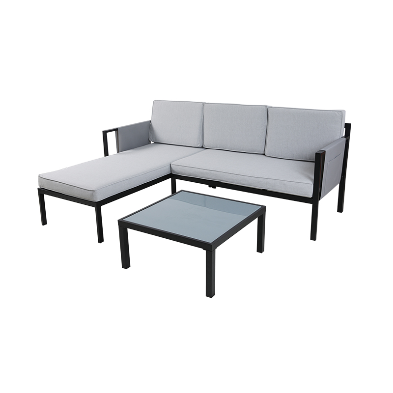
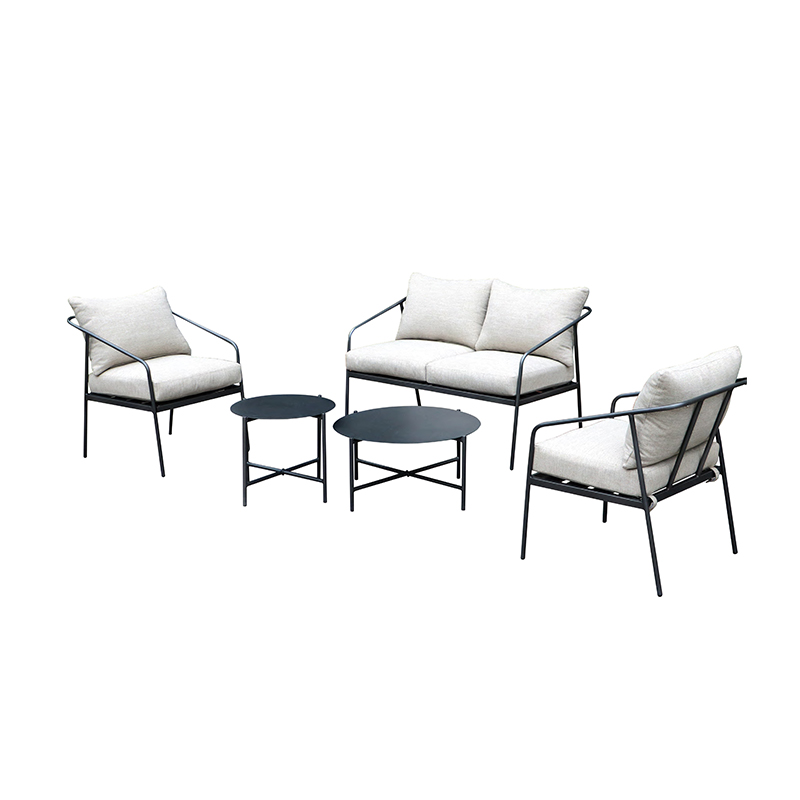
 You May Also Like


 Tel
Tel
 Email
Email
 ADDRESS
Building #7 , No. 399, Yuangang Road, Tianhe District, Guangzhou, China.